
Color trends for Christmas 2025: adopt the palettes that will sublimate your décor
As Christmas 2025 approaches, households are looking for clear reference points. Trendy colors guide choices, without erasing your family history. In this way, the holiday gains in coherence and softness.
Christmas 2025: palette, materials and ethics
For Christmas 2025the decorating press, including Elle, is emphasizing measured warmth. Trendy colors are supported by palpable materials. What’s more, the duo of velvet and linen is reassuring. As a result, the tree gains in depth.
The gesture counts as much as the effect, even for trendy colors. As a result, many people are opting for parts that can be reused and repaired. On the other hand, disposable plastic is on the decline. Metallic accents are more appropriate than swathes of them.
Classics revisited
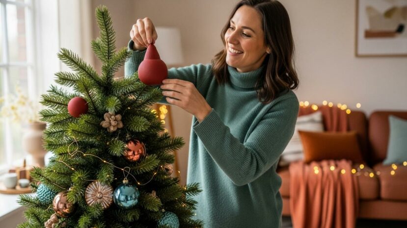
Red and green don’t disappear. Instead, they take on muted shades of burgundy and fir green. Trendy colors pair them with
“A coherent tree reassures, a bold touch surprises.”
Midnight blue is making a comeback in French living rooms. However, these trendy colors require a light hand. Combine it with aged silver or smoked glass. As a result, the table gains a discreet relief.
Four up-and-coming chromatic families
Four families are emerging based on feedback from stores and trade shows. Trend colors can be divided into 4 chromatic families. First, a mineral trail combines white, silver and glacier blue. It also soothes bright rooms.
- Adjust the lighting before placing the decorations.
- Limit the palette to three major shades.
- Vary textures to create relief.
- Add one natural element per zone.
- Check out the smartphone photo rendering.
Alongside this, a natural look focuses on moss green, bark brown and hemp. These trendy colors also gain in relief with patinated copper. Satin-finished surfaces avoid glitz. As a result, every room breathes.
The spicy palette appeals to warm interiors, as these trendy colors gently warm. Terracotta, cinnamon and copper interact without imposing. A tea rose or champagne softens the ensemble. In short, the eye follows a calm rhythm.
Finally, frosted pastels are gaining ground in light rooms. Trendy colors cross paths with powder pink, lilac and pearl. Also, frosted finishes support consistency. Shine, on the other hand, is limited.
Practical tips and home harmonies
Before you buy, observe the light every hour of the day. That way, you can adapt the trendy colors to the actual orientation. A cold white quickly turns blue in the north. Therefore, a warm tone saves the balance.
Experiment with a small area. Also, group materials into tactile families. The brain reads wood, metal and velvet better. The photo also serves as a concrete test.
Responsible purchasing and budget control
At the end of the year, the budget is tight. However, you can aim for the right colors without giving up. Rent a neutral base, then add
Repair rather than replace too quickly. What’s more, LED garlands can often be repaired in modules. A damaged ribbon becomes a gift bow. In short, waste is reduced.
Give meaning by involving loved ones. Plan a workshop corner to personalize two rooms. You’ll anchor your choices in time and memory. Trendy colors gain in shared emotion.


No comments
Post a comment
Always participate in accordance with the law and with respect for others.