
Balanced decoration: the key detail to look after in 2025 for a truly harmonious interior

In our interiors, a discreet detail can transform the decoration of a room. It’s not an expensive purchase, but a precise visual cue that guides the eye and calms the space. A few practical adjustments are all it takes to achieve balance and harmony, whether you’re enhancing a living room or preparing dinner in one of the 5 restaurants for a chic and festive New Year’s Eve dinner in Paris.
The detail that changes everything in decorating: the support line
The pros often refer to this as a “support line”. It aligns frames, mirrors, sconces and shelves at the same reading height. What’s more, this common thread simplifies choices and structures the room without freezing it in place, like a carefully staged room in a Michelin-starred restaurant for epicureans in search of taste and refinement.
Aim for a hanging center at 145-155 cm from the floor, at eye level. This creates a constant visual horizon, from the living room to the hallway. On the other hand, keep a few gaps in between to avoid a catalog effect, much as you would dose colors and textures in the best tea room in Paris.
Aligning without freezing, decorating everyday life
Start by choosing a reference height and marking it with masking tape. Next, group together what can be aligned: top edges of frames, edges of shelves, heads of files. Also, keep a safety margin of 2-3 cm to make up for a small shift, just as you would adjust the distances around the table when dining in Paris, the gift you don’t forget.
“A room breathes when visual cues interact with each other.”
This principle doesn’t have to restrict creativity. Sometimes, you can break the line to highlight an XXL format. In this way, the eye jumps from a stable landmark to a chosen exception, creating rhythm.
In a narrow corridor, a band of aligned objects calms reading. On the other hand, in a large room, alternate between alignments and free sets. In addition, group objects by family, so that each area retains a clear sense of purpose.
- Center of frames 145-155 cm above ground level
- 40-50 cm sofa-low table space
- Carpet protrudes under sofa by 20-30 cm
- Color palette guided by 60-30-10
- Color temperature close to 2700-3000 K
Colors and proportions: lasting balance in decorating
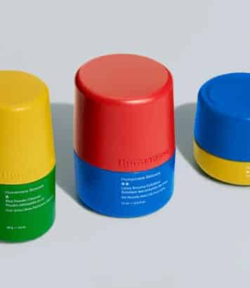
For the palette, a simple rule helps every day: 60-30-10. So, 60% for the base, 30% for the secondary shade, 10% for the accent. What’s more, this division clarifies choices when buying or repainting.
Distribute color by floor plan and volume, not just by wall. In short, let the main hue run over large surfaces. As a result, the eye reads the whole as a coherent whole.
Proportion counts as much as hue. A massive sofa calls for a large light fixture, not a small, lost lampshade. In this way, volumes interact and the room gains in legibility, even with bold decoration.
Furniture, carpets, distances: figures to keep in mind
Maintain a clearance of at least 80-90 cm in traffic areas. Then set the distance between sofa and coffee table at 40-50 cm, so you can move around without discomfort. This way, you avoid angles that catch the eye and the legs.
Under the dining table, leave 60 cm per guest and 90 cm behind the chairs for easy access. In addition, let the carpet extend
Lights, materials and rhythms for lively decorating
Compose a 3-layer lighting scheme: general, accent and accent lighting. Also, stick to a warm light, around
Multiply sources rather than a single ceiling light. In this way, you can calibrate the intensity according to the moment, with a dimmer if possible. On the other hand, avoid direct glare and direct beams towards walls or artwork.
Materials set the tempo. Wood, wool, linen and brushed metal form a soft, legible relief. Repeat the same texture in three places to tie the decor together without overloading.
Finally, keep the look moving with small touches. A line-up, a break, then a reminder of color is all it takes. In this way, the room stays alive and supports the decor day after day.


Aucun commentaire
Publier un commentaire
Participez toujours dans le respect de la loi et des personnes.