
Color combination 2026: a trendy duo for walls and home décor
The house ‘s color charts are already looking ahead to 2026. At the heart of projects, color combinations signal a return to calm, while maintaining momentum. Brands are focusing on soft, easy-to-live-with contrasts.
2026 trends: soft contrasts, lively materials
According to decor previews, the palette warms up without weighing itself down.
Dulux Valentine – A burst of joy (Paint; Solar yellow). As luminous as it is precise, this yellow awakens a living room or kitchen, without harshness.
Pantone – 1-4201 Cloud Dancer (Color; Vapor White). This vaporous white tempers deep tones and lets volumes breathe.
“In 2026, visual comfort will take precedence over the wow effect.”
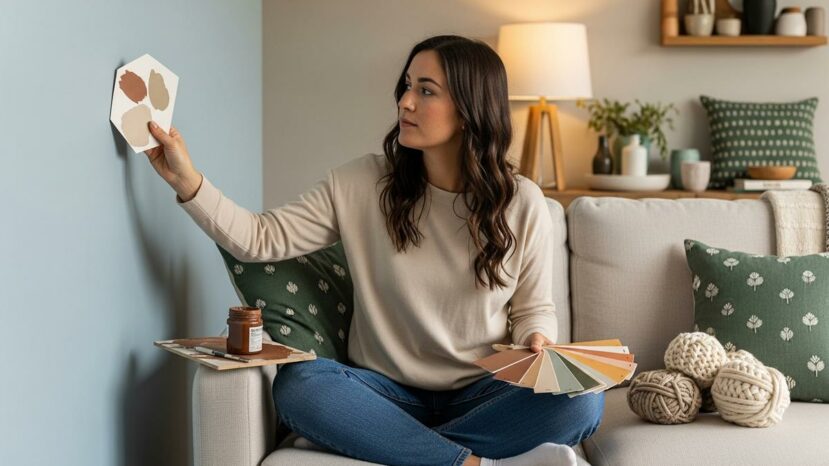
From bedroom to living room: applying the chords
For the bedroom, we aim for softness rather than brightness. What’s more, a matte finish calms reflections and helps you relax. On the other hand, a light satin works well in high-traffic areas.
Valspar – Warm Eucalyptus (Color; Felt green). As a result, this muted green soothes a living room and blends well with light oak.
- Test on an A4 sheet on the wall, in daylight.
- Harmonize ceiling, walls and woodwork: one base, two accents.
- Focus on 3 gestures: shade, texture, light.
- Adjust the shine to suit the room.
- Provide a textile reminder to anchor the agreement.
Behr – Hidden Gem (Color; Felt green). This hue also supports a modernized kitchen and enhances brass handles.
Soothing blues and deep browns
Grayish blues hold the note all year round. Now, they’re paired with deep browns to anchor the decor. These color combinations create calm yet structured rooms.
Dulux Valentine – Vintage blue (Paint; Sky blue grey shade). This blue veils a room in soft, diffused light.
Dulux Valentine – Bleu D’Encre (Paint). This dense blue creates an enveloping, refined dining room.
Benjamin Moore – Silhouette (Color; Espresso brown/deep). In short, this espresso brown anchors a bookcase and warms up the lines.
Touches vives: measured doses of energy
Pop shades come in small, targeted touches. Textiles and wall art act as a relay, without saturating the space. These color combinations gain in rhythm, while remaining legible.
IKEA – Rebel Pink (Color; Bright pink). On the other hand, this pink is best used as a reduced solid color, on a module or niche.
Pragmatic instructions for 2026
We move forward in 3 simple steps: soothing base, deep accent, luminous touch. In this way, the room remains clear from morning to night. This method frames color combinations without curbing creativity.
Dulux Valentine – Eclipse (Paint). Yet this muted, enveloping hue gains in intensity with warm metals.
Careful attention to light changes everything, because the shade lives with it. What’s more, mid-tone woods and raw fibers stabilize color combinations. As a result, the decor retains its relief and softness.
The seasons help to give rhythm to materials and thicknesses. A neutral base also facilitates adjustments over the months. Color combinations can be adapted without redoing the entire room.


Aucun commentaire
Publier un commentaire
Participez toujours dans le respect de la loi et des personnes.