Colors of 2026: the leading shades to adopt in your home, approved by decorating experts
What will be the colors of 2026 for our walls and textiles? Decoration professionals are already sketching out credible leads, fueled by projects and trade shows. For example, the desire for softness guided by nature is making its way into customer briefs.
What the professionals are saying about 2026
The designers we interviewed indicated a demand for reassuring, tactile shades. In addition matte and powder finishes and powdered finishes are winning the day, as they soften volumes.
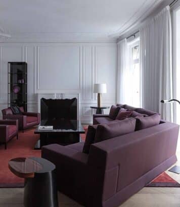
In these exchanges, the colors of 2026 read like an anchored palette, between browns, muted blues and mineral greens. Warm neutrals create a welcoming background without taking away character. As a result, denser accents remain measured to preserve breathability.
Three chromatic families
The first family are fleshy neutrals: hemp, mastic, grège, ivoire bis. These muted tones brighten rooms while calming the eye. What’s more, their warm base enhances wood, weathered leather and pale stone.
“The house needs softness and livable shades.”
Second family: earthy reds and cocoa browns, inspired by natural pigments. These colors can be used in a variety of ways, but are measured out in flat tones or joinery, to avoid a dark effect. Their depth also warms up the evening under subdued lighting.
The third family, inky blues and mineral greens, anchor space. They create a muted contrast that will be found at the heart of 2026’s colors. These 3 chromatic families provide a clear basis for composition without saturation.
- Warm neutrals for soothing backgrounds
- Clay and cocoa browns for depth
- Inky blues for muted contrast
- Mineral greens for natural anchoring
- Honey or terracotta accents
From theory to play: combinations and lights
In a living room, a mastic base accepts three accents without clashing. What’s more, pairing a muted blue with walnut brings a clear presence to the colors of 2026. Also, test the shade in the morning, at noon and in the evening to avoid surprises.
Noname – Vintage Blue (Paint; Variants: Eclipse, Bleu D’Encre) offers a deep, legible and soothing blue on the wall. Its matte texture absorbs light and supports a natural-fiber decor.
The light changes everything, because a cold LED grays out the tints. On the other hand, a warm spectrum between 2700 K and 3000 K awakens browns and rounds out blues. So consider dimming to modulate evening highlights.
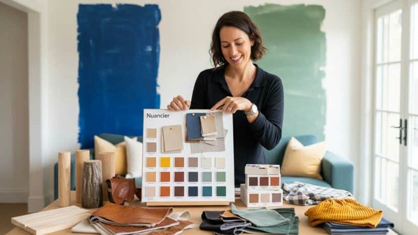
Paint, textiles, wood: how to orchestrate
Start by painting a large cardboard box with the chosen shade, and move it around. This way, you can see the color breathe against wood, metal and fabric. What’s more, this method reduces errors, especially with 2026 colors.
On the textile side, a caramel corduroy gives grain without heaviness. Ivory curly wool, on the other hand, catches the light and calms the ensemble. Brushed brass adds a soft sparkle, more subtle than chrome.
Practical advice and mistakes to avoid
Adopt a simple rule: 1 background, 1 support, 1 vibrant note. This way, the eye circulates, the room stays alive, and each material breathes. What’s more, a consistent color palette limits impulse buying and reduces waste.
Before repainting, smooth walls and clean woodwork for clean edges. Matt or velvet finishes will bring out the colors of 2026 better, without unwanted highlights. Allow plenty of drying time between coats for a long-lasting finish.
For small areas, paint right up to the baseboards to lengthen the line. Also, consider light-colored ceilings that envelop without crowding, a real asset of 2026 colors. In short, a well-mastered project can be read in the coherence of its materials and intensities.