
Star colors for spring-summer 2026: the runway palette to adopt now
Between catwalks, street style and the desire for renewal, the star colors of spring-summer 2026 look bold yet easy to live with. The subject touches on everyday life, as color influences mood, silhouette and even self-perception. Here you’ll find concrete guidelines for choosing and matching colors, without over-consumption.
What the catwalks are saying about the star designers for spring-summer 2026
The major fashion weeks have given clear signals in recent months. The palette is structured around 3 chromatic axes that interact with each other: soothing pastels, vitamin-rich primaries and tactile neutrals. What’s more, this triad allows you to alternate sober looks with luminous accents, depending on the mood of the day.
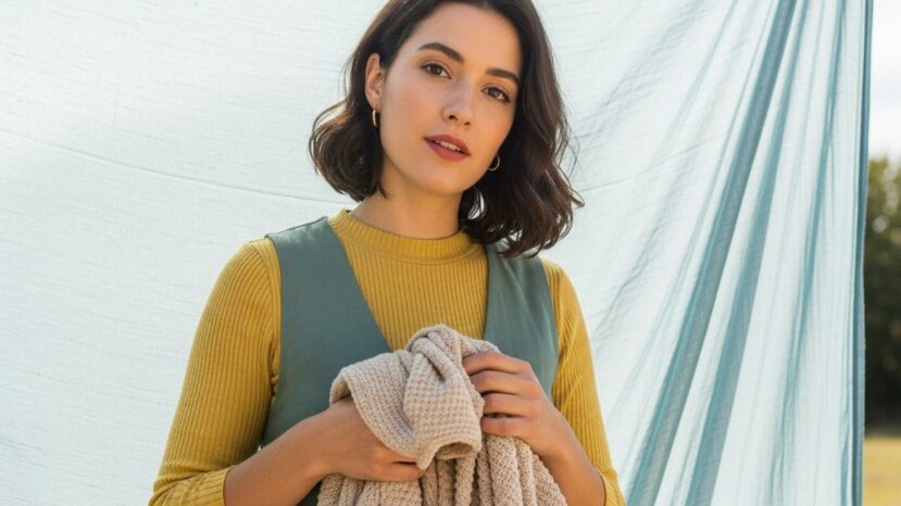
Sand, putty and clay neutrals create a reassuring base. On the other hand, buttery yellows, sunny reds and airy blues serve as dynamic touches. Fresh greens and soft purples complete the equation, especially as the light becomes brighter in spring.
Light changes everything: a hue can look soft indoors, then vibrate in the sun. So choose materials that reflect color well, such as mercerized cotton or washed silk. What’s more, a slightly satin finish often makes the shade more luminous, without a garish effect.
“The right tone isn’t just a fashion statement: it’s a tool for feeling better, looking better and moving better every day.”
How to wear the star designers of spring-summer 2026 every day
In the office, a worked neutral sets a chic base. For example, sandy pants can easily be paired with a light blue top or a soft yellow knit. A tomette-red accessory may also be enough to liven things up, without upsetting the balance.
For the weekend, dare to use color close to the face, as the complexion gains in freshness. What’s more, one strong piece can guide all the others, such as a lagoon blue skirt with a creamy white tee. The star conleurs of spring-summer 2026 then play the role of landmark, while neutrals tie everything together.
- Start with a colorful accent, then adjust.
- Test the shade in daylight and artificial light.
- Choose a material that breathes well.
- Balance: 1 strong color, 2 neutrals.
- Keep the layering option light.
What the star designers of Spring/Summer 2026 mean for mood
Pastels provide visual breathing space. For example, light blues encourage concentration, especially on a busy day. In addition, soft purples suggest a gentleness that’s perfect for formal meetings as well as moments of pause.
Reds and oranges breathe life into a room. As a result, they are reserved for occasions when you want to occupy space with confidence. And the key is nuance: a tomato red looks sunnier than a burgundy, which is more rooted.
Fresh greens symbolize renewal. However, a green that is too acidic can dominate the silhouette, so choose it as an accessory. A soft green bag or pistachio scarf adds life, without imposing a single interpretation of the look.
These choices also reflect our connected daily lives, where the eye seeks clear signals. Palettes can now be adjusted between brightness and softness, to go from screen to street in a single step. The star conleurs of Spring-Summer 2026 synthesize this fluid shift, without sacrificing chromatic comfort.
Smart shopping and sustainable rhythm
Think wardrobe before basket. Take your favorite neutral pieces and add a colorful touch that works with at least three existing outfits. What’s more, second-hand and rentals offer smart options for trying out a daring shade without making a lengthy commitment.
Maintenance prolongs the life of the colors. So, wash at low temperature whenever possible, and turn colored pieces inside out. Also, avoid intense drying, as it fatigues the fiber and dulls the color.
Styling tips and sustainable wardrobe
Build simple duos: a sand or putty base is well suited to a sky blue or buttery yellow. In this way, two neutrals for a strong color create a legible whole. What’s more, fine stripes often unify two shades that are reluctant to cohabit.
Beauty and accessories amplify the effect. Coral lips, for example, echo an orange accent without overdoing it. Consequently, a soft blue varnish may suffice to recall the main note, especially if the outfit remains minimalist. The star conleurs of spring-summer 2026 become a story of well-placed details.
Take care with textures, as they modulate color. For example, a textured cotton softens a bright tone, while a clean poplin asserts it. Also, a knit with holes lets air circulate and plays with the skin, bringing the shade to life.
For photos, golden light at the end of the day favors warm colors. On the other hand, bright midday light enhances light blues and greens. In short, think of the background: a cream or stone wall brings out almost any palette.


No comments
Post a comment
Always participate in accordance with the law and with respect for others.