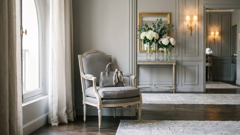
Christian Dior chose this grey for his Avenue Montaigne boutique back in 1946


In luxury, a colour can be worth as much as a logo. From Dior grey to Hermès orange, five great Houses have turned a single shade into their most recognisable signature. In 2026, these hues remain powerful identity tools that reach far beyond mere packaging.
Tiffany Blue and Hermès orange: two shades, two very different stories
Tiffany Blue is one of the most famous colours in the industry. Sitting somewhere between blue and green, this shade has been associated with New York jeweller Tiffany & Co for more than 180 years. Its founder, Charles Lewis Tiffany, chose it as the signature colour of the Blue Book, the sales catalogue for his jewellery collection.
The shade now carries number 1837 in the Pantone Matching System, a reference that echoes the year the brand was founded. Although the colour does not appear in the Pantone swatches available to the general public, Tiffany & Co has indeed trademarked its signature shade, deploying it across all its packaging, brand activations and retail locations.
For Hermès, by contrast, the choice of orange was anything but deliberate. Behind this legendary hue lies an anecdote dating back to World War II. A shortage of pigments caused by wartime rationing forced the House to turn to cardboard, the only available colour of which happened to be orange.
From constraint to signature: how orange became Hermès
Originally, the saddler had opted for beige faux-leather packaging fastened with brown ribbon. The war changed everything. Once the conflict was over, Hermès embraced the shade, which officially became its reference colour in the 1960s.
Today, the iconic Hermès boxes sell for considerable sums on resale platforms, even when empty. A colour born by accident has thus become one of the most coveted symbols in global luxury.
Dior grey: a shade chosen by Christian Dior himself
Dior grey holds a singular place in the House’s history. Christian Dior personally selected it for the decoration of his historic boutique at 30 Avenue Montaigne, which opened in 1946. The choice was far from arbitrary: it reflected a precise vision of understated elegance.
“The most practical and most elegant of neutral colours,” Christian Dior, on the subject of grey.
Of Dior grey, the couturier also said it was “the ideal colour for women who divide their time between the city and the countryside.” This dual vocation, urban and pastoral, partly explains the shade’s enduring place within the House.
Beyond that, Dior grey inspired the fragrance Gris Dior and has been the subject of dedicated set designs. The shade is now protected as a registered trademark of the House, making this neutral colour a fully-fledged legal and commercial asset.
- Dior grey was chosen by Christian Dior for his boutique at 30 Avenue Montaigne in 1946.
- Tiffany Blue carries number 1837 in the Pantone Matching System, a nod to the year the brand was founded.
- Hermès orange was born out of a pigment shortage during World War II.
- Valentino Red was first presented in 1959 in Rome, with the Fiesta cocktail dress.
- Fendi yellow appeared in 1933, inspired by the pergamena, a parchment used to cover travel trunks.
Dior grey: a protected shade that is still very much alive
The legal protection of Dior grey illustrates a powerful trend in luxury. Houses are no longer content simply to choose a colour: they defend it in court. This approach guarantees visual consistency across every touchpoint, from boutiques to advertising campaigns.
In 2026, the House’s grey shade remains present in set designs and collections alike. The fragrance Gris Dior is its most direct expression. Dior grey thus travels through the decades without losing any of its relevance.
Valentino red, Fendi yellow and the signature colours of other Houses
In Rome in 1959, Valentino Garavani founded his fashion house and presented a richly colourful collection. Valentino red was embodied by the Fiesta cocktail dress. The couturier, who passed away last January, recalled falling for the colour after spotting a woman wearing it in a box at the Barcelona Opera House.
The shade now runs through the entire history of the House. In 2022, Valentino also added PinkPP to its palette. Nor is red the exclusive preserve of fashion: at jeweller Cartier, a deep carmine red gradually established itself as the House’s official colour during the interwar period.
Founded in Rome in 1925, the House of Fendi saw its sunny yellow emerge in 1933. The shade draws its inspiration from the pergamena, the parchment that lined many travel trunks and suitcases of the era. Paired with black in a duo that has since become a classic, this yellow now flows through the campaigns, packaging, stationery and boutique interiors of the Italian house.
Other Houses have also made a colour their signature, with more recent stories to tell. At Bottega Veneta, the vivid green nicknamed “Parakeet Green” was introduced by Daniel Lee during his tenure as creative director between 2018 and 2021. That same Daniel Lee then brought Knight Blue to Burberry from 2023 onwards, an electric blue drawn from the British brand’s archives. At a time when logo visibility has a diminishing influence on luxury purchasing decisions, colour remains one of the most powerful identity tools in the industry.